A quick Google search on ‘minimalism’ will lead you to a vast array of self-help articles promoting minimalism as a life philosophy that can bring happiness. While we can’t say for sure that it would resolve your existential issues, when it comes to interior design, minimalism is definitely a sure-fire route to success. Decluttered spaces, bare walls, and muted design components are all central to this popular aesthetic. Looking for a focused sense of clarity in the sanctuary of your home? Look no further than minimalist interior design. Read on to admire a few noteworthy designs that truly capture the essence of “less is more”.
More Space the Merrier

HDB 5 Room – Sumang Walk by Design 4 Space Pte Ltd
Minimalism does not mean “spend less” – it means paying careful attention to and highlighting each piece of furniture you put on display. As with yourself, make sure to give individual parts of your home space to breathe. In this HDB minimalist interior design, the few pieces of furniture are generously spread out, enabling each item to stand out on its own. The sleek black couch and world map artwork on the wall can easily be appreciated without any background noise. As Design 4 Space puts it, “minimalist design shows restraint, a careful paring down and editing of spaces to get to a place of clarity”.
Simple and Functional

HDB 4 Room Resale – Bishan by The Local Inn.terior Pte Ltd
The intricate, complex details present in modern and contemporary designs are absent in minimalist interior design. Colors are kept to basics and blend well together to form a cohesive whole, even if the different pieces are relatively spaced out. In this design, the home sticks to a clean, neutral palette that ensures no one item appears out of place. Although seemingly simple, the space of this design is well thought-out. As The Local Inn.terior puts it, “every corner of the space is designed according to the homeowners’ lifestyle”.
Less but Edgy
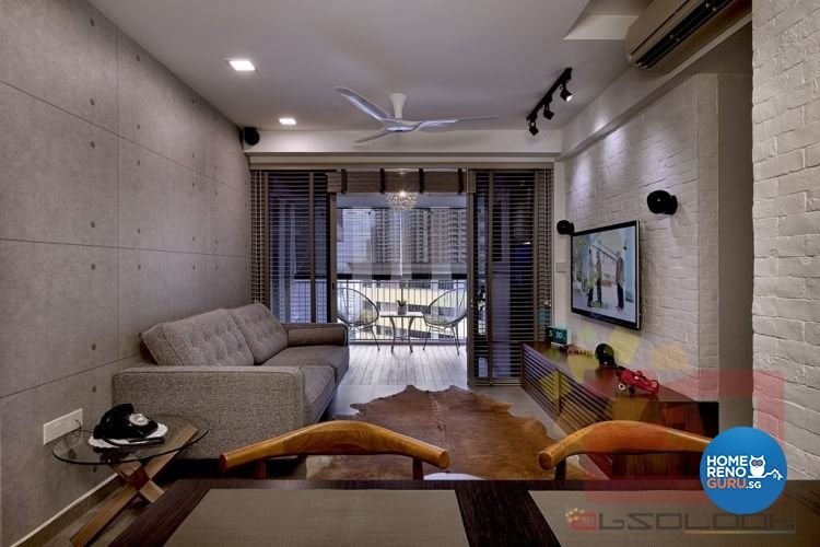
The Peak @ Toa Payoh by Absolook Interior Design Pte Ltd
A common misconception is that minimalism must be bland and out of touch with more “artsy” trends. Rather, minimalism is more focused on spatial organization and can easily accommodate eclectic features. In this loft design by Absolook Interior Design, the interior is characterised by an industrial edge, complete with space grey tones, exposed brick and a wall resembling metal plates. Even then, the minimalist core remains–uncluttered spaces and simple, functional furniture.
Classic and Clean
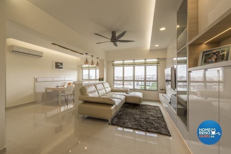
HDB – Blk 422B Fajar Road by New Interior Design Pte Ltd
Nothing beats the satisfaction that a clean, pristine living space can give. With a restrained design strategy, minimalism can easily achieve that look, especially with the addition of a consistent and neutral colour scheme. Judy from New Interior Design describes her design as one that “creates a relaxing environment free of clutter for the owner to relax and unwind at the end of the day”. In this classic minimalist layout, the living space aligns with a smooth, monochromatic beige finish that keeps the home looking fresh. The glossy finishing on the walls, cabinets, and floor add a bright glow necessary for warm, comfortable living.
Let Your Furniture Shine

Clementi Ave 3 by Ace Space Design Pte Ltd
The best part about minimalism is that it lets great furnishing speak for itself. With all the clutter out of the way, guests at your HDB can marvel at the fine woodwork lining your bare walls or the sleek black TV positioned as the centerpiece of the living room. Such is the case with this design by Ace Space Design, which likewise takes on an industrial aesthetic. The natural, multi-dimensional wooden panel that flanks the television immediately captures the eye, not having to compete for attention with anything else in the way.


