Picking the perfect colour scheme can feel like a wild rollercoaster, especially if it’s your first big renovation and you’re about to drop a huge sum of big girl, or boy money. Fret not, mastering a cohesive palette does not mean playing it safe all the time! Here are some tips and projects to help you keep things consistent while knowing when to break the rules and let your creativity shine!
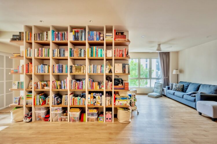
Designed by Apartment Interior
Get Inspired, Do Your Research
Kickstart your renovation journey with a burst of creativity! Dive into the vibrant worlds of Instagram, Pinterest, and even your favourite local spots. Snap pictures of everything that captures your imagination—from that charming local bakery to your friend’s chic living room. Don’t hold back; let your creativity flow!
Create mood boards that bring your vision to life and organize all those brilliant ideas. Whether it’s colour palettes, unique textures, or stunning furniture styles, visualizing your dreams will set the stage for an incredible transformation. So, grab your phone, start exploring, and let the inspiration fuel your design process! Your dream space is waiting to be unveiled!
The 60-30-10 Rule
On the technical side of renovating, having a formula can be a game-changer. The 60-30-10 rule helps balance your colour choices for a well-rounded look:
⭐ 60% – Main Colour: This should dominate the space, usually a neutral tone that sets the backdrop
⭐ 30% – Secondary Colour: Adds contrast and depth, complementing the main colour while standing out
⭐ 10% – Accent Colour: Provides a burst of vibrancy or interest, tying the design together
Cool Grays and Earthy Browns: A Palette for Peaceful Living
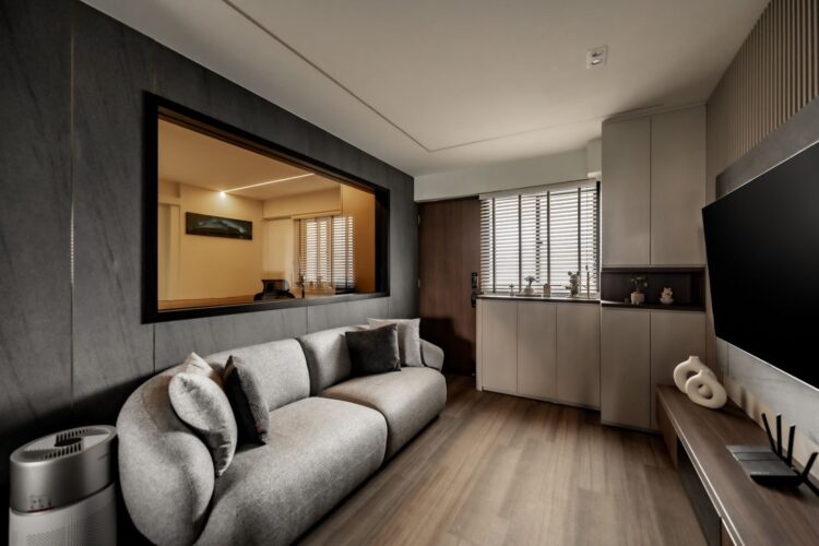
Designed by U-Home Interior Design Pte Ltd
Starting with something simpler, this living room is like a zen retreat with its cool neutral palette. The grey couch and dark grey accent wall vibe together, adding just the right amount of depth without turning the space into a cave. The white ceiling and storage play nice with the walnut floors, door and storage, bringing in some warmth for your home.
With its neutral tones, the room feels vibrant and connected, thanks to thoughtful decor like mini plants, white vases, and wooden elements. The large window that opens to the study room adds an airy feel, allowing natural light to flow through and visually expanding the space.
Key Highlights:
⭐ There is a subtle contrast in the room, the grey-on-grey combination balances perfectly with the white ceiling and rich brown floor
⭐ The window that connects the living room to the study room enhances the sense of openness and light
⭐ Plants and wooden finishes bring warmth and a touch of nature to the modern design, which connects the whole house altogether
Chic and Bold: Blue Cabinets That Captivate
Designed by Apartment Interior
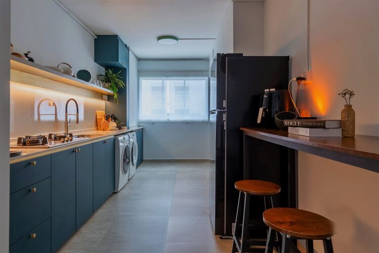
In this renovation, the kitchen breaks away from the rest of the house’s 60-30-10 rule by making a bold move—hello, blue cabinets!
With the addition of this striking colour, the goal is to create a specific mood, such as a burst of energy and visual excitement. The pop of vibrant blue shakes things up against the room’s chill white, brown, and grey vibes, making it the ultimate eye-catcher!
Even though the kitchen has its own vibe and character, it still stays in sync with the rest of the house thanks to consistent design details like wood finishes, warm lighting, and a touch of greenery. So while the kitchen serves major looks, it still blends well with the overall aesthetic of the home.
Key Highlights:
⭐ The pop of blue gives the kitchen major personality, standing out from the other rooms Incorporating the blue storage also adds both functionality and a fabulous style
⭐ This shade of blue keeps the space lively yet cosy
The Understated Beauty of Beige and White Tones
Designed by Apartment Interior
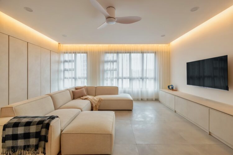
This living room embraces a soothing beige and white palette, creating an airy and inviting space that contrasts with the darker tones used in the rest of the house. The warm lighting and slightly extruded ceiling add a cosy feel, while minimal black accents, such as the TV and blanket, provide subtle contrast without overwhelming the room’s neutral tones!
The spotlight is on chill, understated elegance here. Sheer curtains and warm lighting team up to keep things breezy and open, while personal touches like the TV on the white wall and stylish portraits give the room some character without messing with the zen vibes.
Key Highlights:
⭐ The beige and white colour scheme creates a peaceful and cohesive look
⭐ The minimal use of black, limited to the TV and blanket, keeps the room refined and sophisticated
⭐ Implementing warm lighting in the extruded ceiling adds to the room’s comfort and spacious feel


